What is Hello Email?
About the Product
Hello Email is an email marketing platform for small businesses and startups without a marketing team. The AI connects to a user's shop, learns what they sell, and writes email campaigns for them. No prior knowledge needed.
Why It's Different
The team behind Hello Email are email marketing specialists with real domain expertise and an existing customer base, including brands like The Body Shop, bedrop, DF Automotive and Ritzenhoff. This isn't just another vibecoded app. It's a product with a strong foundation and a lot of room to grow.
My History with the Project
I'd worked with Hello Email at various stages of its early development as a designer for the agency that built it. When the team came to me with a specific brief around the editor, I already knew the product, its users, and its quirks.
What was holding the product back?
A Generic Editing Experience
The existing editor worked like most email builders: pick a text block, an image, a button, drop them on the canvas, style each one individually. That puts a lot of responsibility on the user, and Hello Email's users are shop owners running their business, not designers. They don't have time to figure out what looks good, and they shouldn't have to.
AI Without Structure
The AI was writing relevant copy and pulling in the right products, but it was assembling emails from the same raw building blocks the users had. No predefined sections, no design rules baked in. Functional results, but never quite polished.
Hitting a Wall
The brief was to figure out how the editor could be improved so that the emails coming out of it would look better. A reasonable scope. But the more time I spent with the system, the clearer it became that tweaking the editor wouldn't be enough — the underlying architecture was the limit. So early on, I went back to the team with a different proposal: here's what I'm seeing, here's why improving the current editor won't get us where we want to go, and here's what I think we should build instead. That conversation changed the project.
What needed to change?
Sections, Not Elements
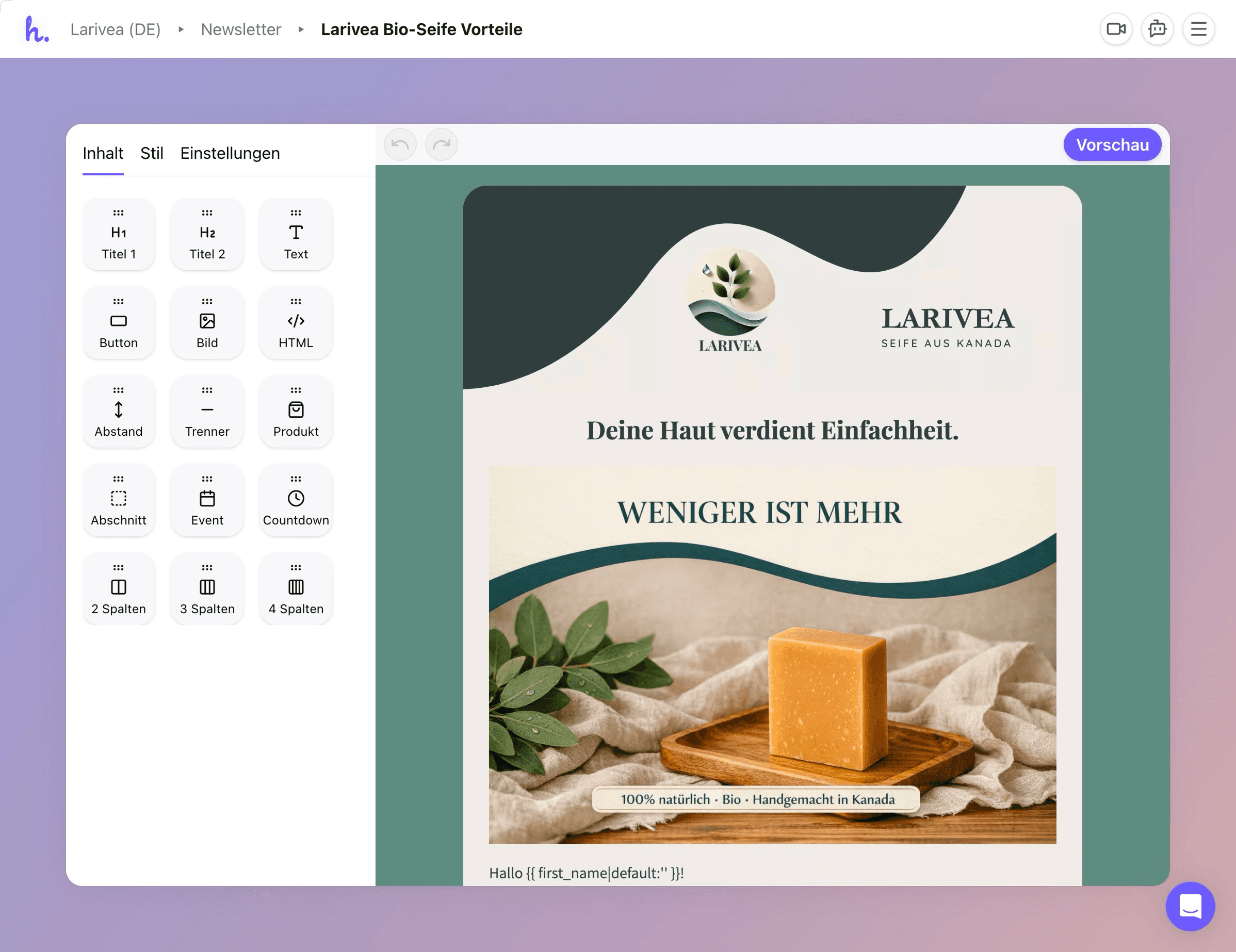
The fundamental shift was to stop thinking in individual text blocks and image blocks that can all be freely styled. That model works for designers, not for people who just want a good-looking email. Instead, the system offers pre-designed sections — a hero, a feature grid, a spotlight — where each one already follows the right design principles and is flexible enough to adapt to any brand, any content, any combination of settings.
Better for the AI, Too
This section-based approach also gives the AI something it never had: structure. Each section carries specific instructions about what kind of content belongs where, what the headline should do, what length works for the body copy. The AI can compose emails from these building blocks with much better results than when it was working with a blank canvas.
How did I go about it?
Starting in Figma
First phase: the foundation. Editor shell, token system, section architecture. Figma was the right tool for exploring typography scales, colour logic, and spatial relationships in a controlled environment.
Moving to Code
But an email editor is fundamentally interactive, and at some point I needed to know how it actually feels to move a section, toggle settings, watch a colour ripple through everything. Figma can't tell you that. So I built fully functional prototypes using Claude Code in VS Code, and dozens of decisions that looked fine in Figma turned out to feel wrong the moment I could interact with them.
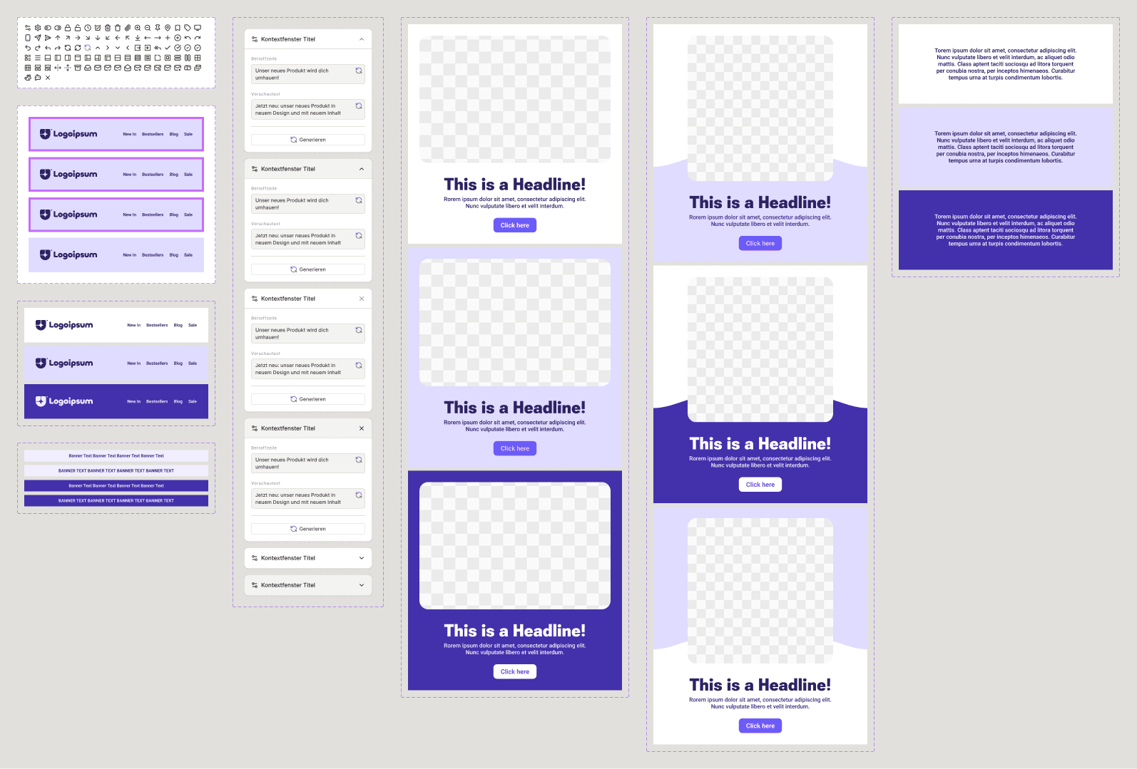
The Block Library

A separate playground I developed for designing and testing sections in isolation — configurable across all tokens and colour settings before they enter the editor. It sounds like an internal tool, and it is, but it's also where most of the real design work happened.
The Editor Prototype
The actual composition experience: stack sections, rearrange them, configure through a contextual panel, watch the email come together in real time. Both tools share one codebase, so every change I made showed up everywhere immediately.
What does the new experience look like?
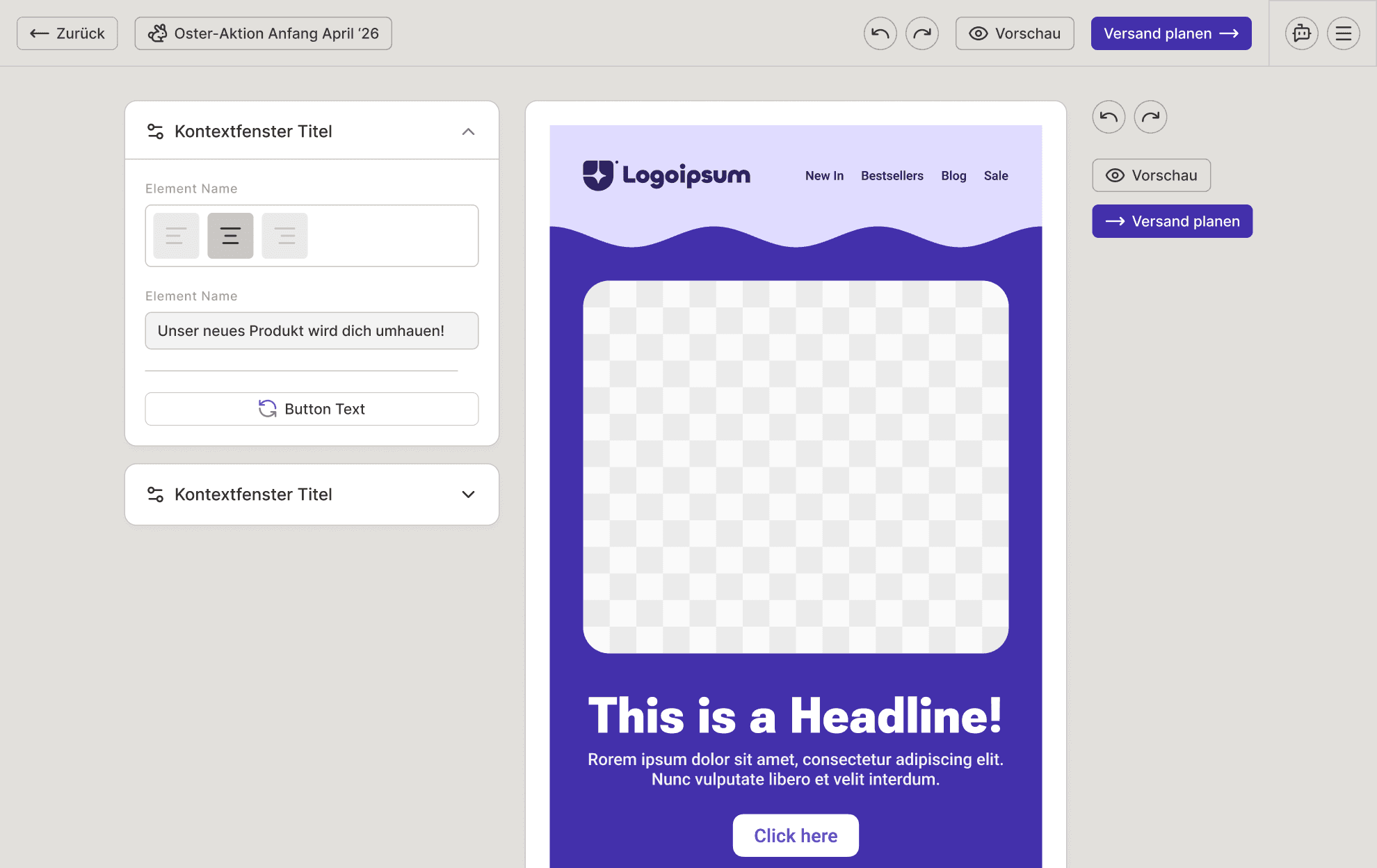
One Panel, Not Five
Most email editors spread settings across toolbars, sidebars, and property inspectors, all visible at once. Hello Email has one contextual panel that shows what's relevant to the section you've selected, grouped by what you're actually trying to do. Nothing else in the way.
Quick Iteration
Not happy with a section? Flip through different layouts in seconds. Every layout works with the rest of the email and the content that's already there, so you can experiment freely without breaking anything.
Templates That Set the Frame
Most emails follow a pattern: the first and last sections stay the same across campaigns. The template editor lets users define that frame once, the AI fills in the middle, and the result already feels like their email before they've touched anything.
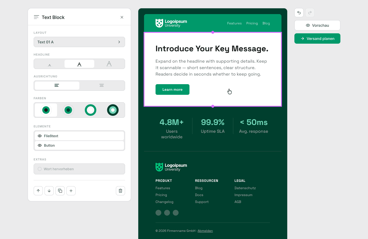
Global Controls
Typography, spacing, and proportions are controlled through three scales: S, M, and L. One brand colour generates a full palette with four variants per section. The user makes a handful of choices; the system makes hundreds of consistent decisions from them.
Transitions, Not Gaps
Wave and torn-paper transitions between sections create visual flow, integrating seamlessly with background images that extend into the transition zones. Emails feel like one continuous piece.
Did it land?
From Brief to System
What began as a two-month project to "make emails look better" turned into a complete design system, two working prototypes, a section architecture, and technical documentation for developer handoff.
Impact
The response was very positive. What resonated most wasn't just the prototypes — it was the decision to step back from the obvious fix and address the root cause. The team appreciated that I took the project into my own hands early and proposed a direction they hadn't considered. The dev team is now building on it.

© 2026 Tom Wabner.
All rights reserved.